What Should You Hang in a Reception Area to Make Clients Trust You Faster?

What Should You Hang in a Reception Area to Make Clients Trust You Faster?
There is a lot of silent talking done in your reception area.
Clients are already gathering hints before you can say hello, before they know your process, and even before they see a proposal. They are asking themselves: Is this place organized? Are they detail-oriented? Are they secure and business-like—or hysterical and makeshift?
The best part is that you do not need a huge budget or a complete interior design plan to make the first impression more credible. You only have to hang the right things—and hang them effortlessly.
The following are practical, high-impact suggestions of what to decorate your reception walls with to ensure that your clients feel at ease, secure, and willing to engage in business with you.
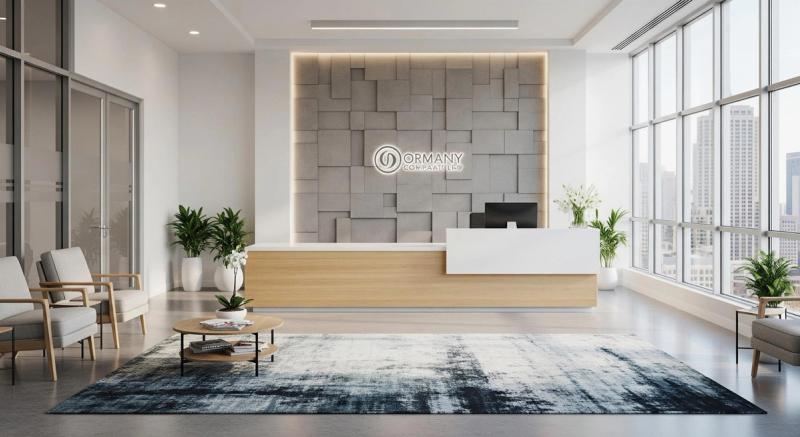
1) Statement art in line with the brand (a single powerful point of focus)
Do but one thing: create one focal point which pins down the space.
One carefully selected artwork on the wall behind the reception desk (or on the wall the clients see when waiting) can instantly create the mood. It indicates confidence and clarity, particularly when it fits your brand personality.
How to choose it: Select a style that fits your tone (minimal, bold, calming, creative, premium, etc.). The color palette should suit your brand or space instead of fighting it. Shoot to be memorable, but not distracting. Clients should not be overwhelmed; they should feel something.
What it communicates:
- Consistency: You have made conscious decisions.
- Stability: You make investments in the environment.
- Professional flavor: You care about appearance.
As an illustration, an elegant flower poster can be surprisingly effective in any business since it conveys warm and caring imagery—particularly when the colors align with your business and the print finish is contemporary instead of generic.
2) A wall that displays who we are clearly—without the salesy feel
Customers do not feel secure with companies that are secretive. The reception area is a good place to be open—but simply do it in a way that is human, not like a billboard.
You might want to consider getting a small portion of the wall space devoted to a plain "who we are" display:
- A brief mission statement (one sentence).
- Three values (not ten).
- A sentence regarding client expectations (time, procedure, tone).
- A brief list of what we do (plain language).
The trick: It has to be brief, visually minimalistic, and readable even from a few feet away.
Design tips: Big type, ample spacing, and contrast. Avoid corporate buzzwords. Write it like you speak. Ensure that it fits the tone of your website (friendly, premium, technical, etc.).
What it communicates:
- Understandability: You are able to describe your work simply.
- Integrity: You show who you are.
- Trust: You do not need to use hype to sell.
3) Social evidence—designed and edited
Human beings believe in what others believe in. That's not cynicism; it's human nature. Social proof decreases risk and gives customers the feeling that they are in good hands.
Excellent reception-appropriate social proof:
- Some well-known client logos (with permission).
- A brief testimonial (two to three sentences, no longer).
- Awards, certifications, or professional memberships.
- Media references (one or two, not a scrapbook).
- A "years in business" or "projects accomplished" stat—only when it is real and meaningful.
How to do it well: Curate ruthlessly. A few good things will beat an untidy wall every time. If you show testimonials, identify the person (name, company, position) wherever possible. Use the same design: similar frames, alignment, and spacing.
What it communicates:
- Competence: You have gotten good results with others.
- Reliability: You are not new (or you are believable even if you are).
- Accountability: You have no problem being judged publicly.
4) Photos of a team that are real (not posed)
It is much easier to trust when customers can physically see with whom they are dealing. When your company is human-based or service-oriented (consulting, creative, legal, healthcare, tech services), it can be a strong trust signal to display the human face behind the work.
However, there is a downside to this, too: excessively posed, clumsy, or old-fashioned photos will work against you.
- What works: Social portraits that are evenly lit with a light background. An open team picture that is up-to-date and spontaneous. Images that fit your brand energy (formal vs. casual).
- What to avoid: Grainy prints. Pictures from five years (and three hairstyles) ago. Bad taste or inconsistent styles that appear thrown together.
Even a single team image placed strategically can do the trick if you do not want a full gallery wall. A small picture frame on a shelf or wall could suffice to introduce that human element without making your reception look like a family scrapbook.
5) Calming graphics for the waiting area
Clients will think their wait is longer when they are anxious, even if it is short. Medical, financial, and high-ticket services particularly enjoy the calming effect of visuals.
This is where you lean into:
- Nature imagery.
- Soft gradients.
- Gentle abstract art.
- Local landscape photojournalism.
- Simple line drawings.
Why it works: Relaxing images assist individuals in controlling their feelings. Clients who feel comfortable will get more out of the entire experience—and appreciate your competence and empathy.
Practical tip: Put the soothing art in the client's line of sight when sitting. Do not place the piece behind them where it will not make any difference.
6) Local signs that indicate we belong to this community
Trust increases with a sense of grounding and familiarity. When you are serving a local audience, put in a slight reference to your locality:
- Local photography (streetscapes, landmarks, mountains, cultural details).
- A local artist's artwork (with a small credit tag).
- A minimalist map image of your neighborhood/city.
- An old picture with new text.
This works particularly well with professional services, clinics, and agencies, as clients desire to feel that you relate to their situation.
Keep it tasteful: It is aimed at belonging rather than tourism. One or two pieces are plenty.
7) The concealed trust factor: congruency, distance, and silence
This component is not glamorous, yet it is more important than generally believed.
An ugly artwork displayed at a crooked angle will destroy the trust you worked to establish. A wall of random heights with random frames might be interpreted as disorderly. Smudges, dust, or sun-faded prints appear to indicate indifference.
Simple checklist:
- Hang frames level (use a tool, not your eyes).
- Maintain a regular distance between frames.
- Key pieces should be placed at about eye level.
- Avoid glare from overhead lights or windows.
- Replace anything that is old, scratched, or worn.
If everything appears in good condition, a client will conclude that you work in good conditions.
What NOT to hang (although it might appear harmless)
Some items are dubious:
- Generic office art that looks like a hotel hallway.
- Aggressive marketing advertisements ("BUY NOW," "LIMITED time," etc.).
- Too many certificates with small, illegible text.
- Debatable issues (politics, crass jokes, irreverent quotes).
- Disorganized collage walls that look unintentional.
Personality is possible without making clients question your judgment.
Last point: Intention, not price, is the source of trust
Clients do not come in seeking costly decor. They enter hoping they will find assurance that they are in good hands.
Once your reception walls are deliberate, in keeping with your brand, respectful of the client's experience, and clearly kept, you communicate competency without uttering a word.